Crafting Clarity: Introducing the New Shelve Landing Page
Experience the redesigned shelve.cloud – a reflection of Shelve's commitment to simplicity, security, and exceptional Developer Experience.
A New Foundation for Shelve
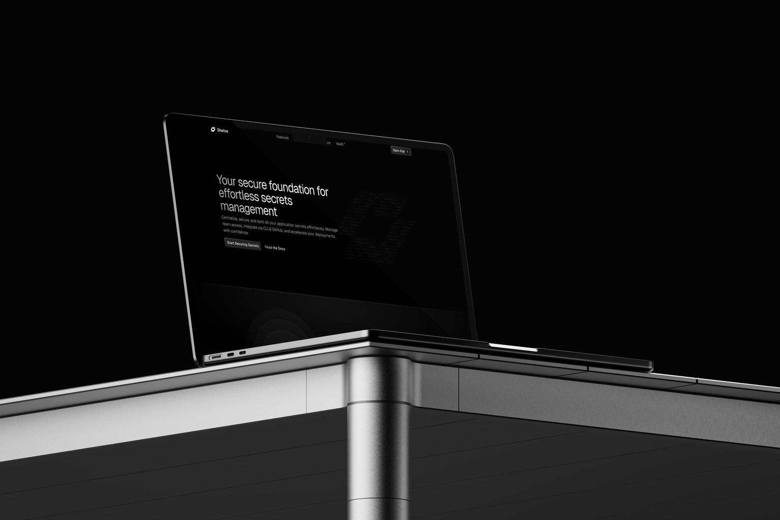
Today, I'm excited to introduce a significant step forward for Shelve: a completely redesigned landing page experience at shelve.cloud. This project was driven by the desire to create an interface that truly reflects the core principles guiding Shelve itself – simplicity, security, elegance, and a deep focus on Developer Experience (DX).
Aligning Perception with Ambition
As Shelve continues to evolve, aiming to be a foundational tool in the developer workflow, it felt essential that its primary touchpoint – the landing page – accurately reflected this ambition and the level of quality I strive for in the product.
The goals for this redesign were clear:
- Establish Clarity & Coherence: Immediately convey Shelve's value in making secrets management effortless and secure.
- Build Trust: Present a polished, professional identity that inspires confidence.
- Ensure Coherence: Align the messaging, visuals, and overall feel with the product's philosophy.
- Elevate the Experience: Apply meticulous attention to detail in design and interaction, making the page itself a pleasure to use.
The result is a landing page and documentation section that feels more focused, refined, and fundamentally Shelve. It provides a clear, coherent foundation that accurately represents where the project is today and sets the stage for its future.
The Craft: Elevating the Experience
Achieving the level of polish and specific design vision I aimed for with this new landing page required not just meticulous planning but also leveraging tools that could accelerate the process without compromising quality or flexibility. While Shelve has always utilized the Nuxt ecosystem, this redesign was an opportunity to lean heavily into the capabilities offered by Nuxt UI and especially Nuxt UI Pro.
The challenge often lies in balancing speed with originality. Building every intricate detail, managing responsiveness across devices, ensuring accessibility, and handling theming for light/dark modes from scratch is incredibly time-consuming. Component libraries like Nuxt UI Pro offer a significant advantage by providing well-architected, production-ready building blocks for many common (and complex) UI patterns. This instantly addresses a large portion of the foundational work.
However, the true value unlocked for this project wasn't just using pre-built components, but the depth of customization they allow. The goal was never to adopt a generic template, but to craft a unique visual identity for Shelve. Nuxt UI Pro facilitates this by enabling extensive tailoring – modifying styles, overriding structures, and integrating custom interactions – all while retaining the benefits of the underlying framework (like type-safety and developer experience). This meant I could focus creative energy on the unique aspects – the specific animations using Motion One, the precise layout adjustments, the custom visual effects – rather than rebuilding standard interface elements. It significantly shortens the path to a sophisticated, bespoke result that truly feels aligned with the brand.
This entire process underscores a philosophy: powerful tools should enable creativity and efficiency, not restrict them. In this spirit, the complete codebase for the landing page and documentation is open-source, available in the main Shelve repository. It serves as a tangible example of how these libraries can be pushed and customized to build premium, distinct web experiences. Feel free to explore how components are adapted and complex layouts are achieved.
It’s often in the finer points and layers beneath the surface where the most interesting details reside, rewarding careful exploration. H1dd3n__P4yl04d!